Logo de l'en-tĂȘte
Diagnostic Newsletter Blog Contact
Ateliers
Principes de conception pour l'analyse
Se connecter
← Back to all posts

What could go wrong during Discovery? - Part 1

Mar 03, 2026
Connect

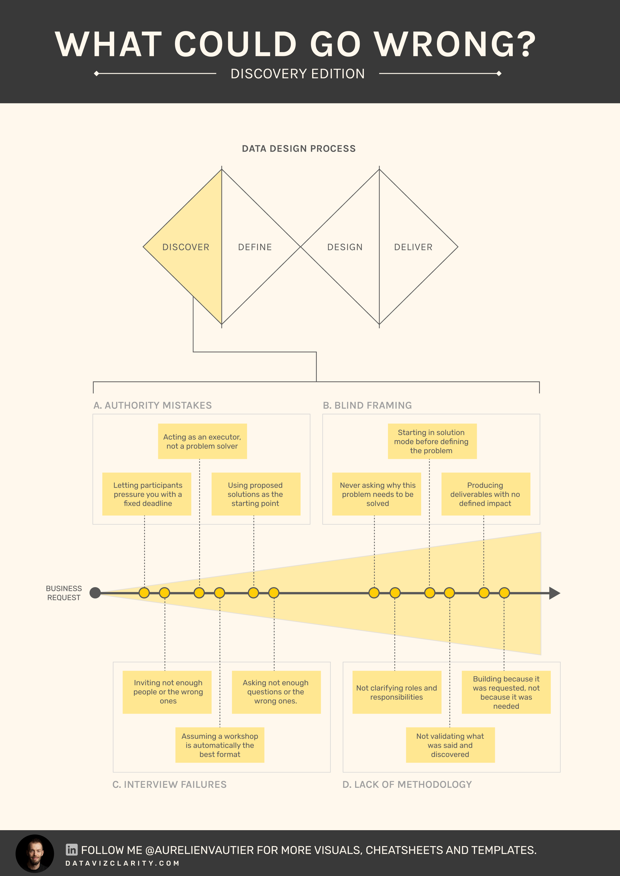
If you’ve been following me, you know how much I work on refining the methodology I call the Data Design Process. 

It helps organizations approach dashboards and reports with a product mindset, grounded in real user needs rather than assumptions.

Over the years, I’ve observed recurring patterns. Not necessarily the most dramatic mistakes, but the ones I see most often.

  • Small deviations.
  • Subtle shortcuts.
  • Structural blind spots.

And they derail projects long before a single chart is created.

Discovery is where value is defined.
When it’s ignored, rushed, superficial, or politically constrained, the outcome is predictable:

  • Low adoption
  • Endless rework
  • Growing business frustration
  • Eroding authority for the data team
  • Polished dashboards with no measurable impact

You may not see it happening, but these 12 mistakes quietly destroy analytics initiatives long before design even starts.

This is part 1 of a 4-part series.

Next week, we’ll focus on the Define step.

If you suspect your team is building without a clear operating framework, let’s run a structured methodology audit.

Begin your Analytics framework audit

Have a great week everyone!

Responses

Join the conversation
t("newsletters.loading")
Loading...
The forgotten step between business needs and charts: Metric Design
*]:pointer-events-auto scroll-mt-(--header-height)" dir="auto" tabindex="-1"> *]:pointer-events-auto scroll-mt-[calc(var(--header-height)+min(200px,max(70px,20svh)))]" dir="auto" tabindex="-1"> I'm writing this week's newsletter from the Périgord region - France, where I'm taking a week off with my family. Being here made me think about something. Last year, 87% of my consulting revenue (...
Every analytics product should pass these three tests
*]:pointer-events-auto scroll-mt-(--header-height)" dir="auto" tabindex="-1"> *]:pointer-events-auto scroll-mt-[calc(var(--header-height)+min(200px,max(70px,20svh)))]" dir="auto" tabindex="-1"> During a recent workshop, several participants admitted they didn't know how to judge whether an analytics product was "good". Then I wrote three letters on the whiteboard: Useful. Usable. Used. Fr...
Introducing the Analytics Design Office
*]:pointer-events-auto scroll-mt-(--header-height)" dir="auto" tabindex="-1"> *]:pointer-events-auto scroll-mt-[calc(var(--header-height)+min(200px,max(70px,20svh)))]" dir="auto" tabindex="-1"> I'm excited to introduce a new concept I've wanted to build for a long time. The subscription model has transformed industries like design. I believe it's time to bring the same approach to analyt...

The Analytics Operating Review

What you’ll get every Tuesday A series of sharp visuals that decode common mistakes in analytics. Fast to read. Easy to apply. Hard to forget.
Logo en bas de page
Politique de confidentialité Conditions d'utilisation
© 2026 Dataviz Clarity