
Tired of rebuilding dashboards you just delivered?
A quick update on the Analytics Card Deck and the waiting list at the bottom of this newsletter. Launch in 9 days! 🎉
You spend weeks building a dashboard.
You deliver it.
And a few days later, the feedback starts.
"Can we add another KPI?"
"Can we add more filters?"
"Can we change this chart?"
"Can we add some color to make it pop?"
"I don't really understand this part."
"It's not very practical to do x or y."
And suddenly, you're rebuilding a dashboard you just finished.
I call this the boomerang effect.
You thought you had reached Deliver.
You're actually going back to Discovery.
And if this happens regularly, you should probably start measuring your Redesign Rate.
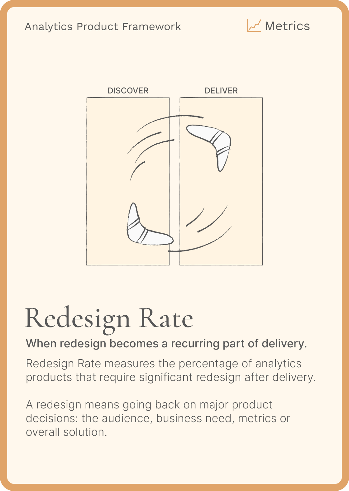
You'll find the back of the card, along with the templates, in the Analytics Product Framework Card Deck.
Redesign Rate = Products requiring a major redesign / Products delivered × 100
If you delivered 10 analytics products this year and had to significantly redesign 3 because they didn't meet user needs:
Redesign Rate = 30%
I'm not talking about fixing bugs or improving a product over time.
MVP => V1 => V2 is normal.
I'm talking about rebuilding something because you discovered too late that the audience was wrong, the need was misunderstood, the dashboard was too complex, users needed something different, or perhaps they didn't need a dashboard at all.
You're paying for weak Discovery later
This is something I see regularly with Data Analysts.
The pressure is always on delivery.
"Can you build this quickly?"
"We already know what we need."
"It's just a dashboard."
So you save a few hours on Discovery.
And lose days on redesign.
Imagine spending 40 days building a dashboard.
With an external consultant charging €600/day, that's already a €24,000 investment.
Then comes the redesign.
But the additional development cost isn't the only problem.
While you're rebuilding, users are exporting to Excel.
They're creating workarounds.
They're not getting the expected value from the product.
And every disappointing delivery makes the next conversation with the business a little harder.
You lose three times:
The initial investment.
The cost of rebuilding.
The value the product should have generated.
And as a Data Analyst, you lose something else:
your time
their trust
Every week spent rebuilding yesterday's dashboard is a week you're not spending solving tomorrow's problems.
Break the loop earlier
If your Redesign Rate is high, don't start by asking how you can build dashboards faster.
Look at what happens before you build them.
- How much time did you spend understanding the problem?
- Did you talk to the actual users?
- Do you know what they're trying to decide?
- Did you understand their current workflow?
- Did you validate something before spending 20, 30 or 40 days building it?
This is why I keep pushing Data Analysts to spend more time on the problem and less time jumping into the solution.
When the problem, audience, context and expected decisions are clear, designing the right solution becomes much easier.
And sometimes, you'll discover that the right solution isn't even a dashboard.
It could be:
- A Big Number.
- An alert.
- A few numbers in an email.
- An exploration tool.
- Or an AI agent.
The best redesign is the one you catch before development starts.
Catch it before you build it
User interviews, problem framing, user flows, mockups and early validation help catch wrong assumptions before they become expensive redesigns.
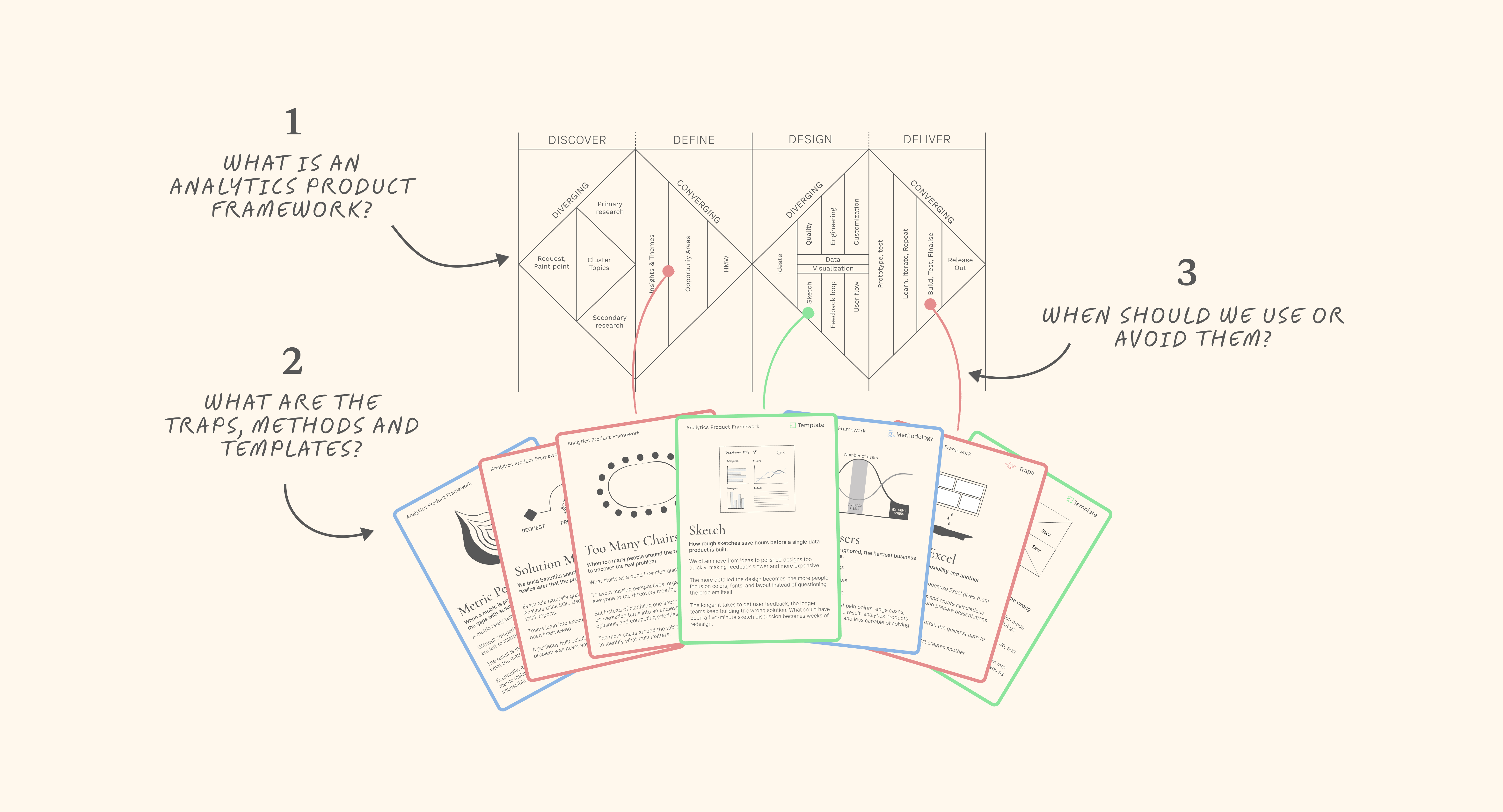
These are exactly the kinds of methods I'm turning into my upcoming Analytics Card Deck.
23 cards so far, covering practical methods, traps and templates for designing better Analytics products.
The complete digital deck launches September 23 at 9:00 AM Paris time.
Have a great week everyone!
Aurélien
Whenever you're ready, there are 2 ways I can help you or your team:
- Analytics Design Principles Workshop: One-day workshops to learn design principles, improve your design process, build your design system, or help business teams make better decisions with data.
- E-Learning: 6+ hours of on-demand content, interactive lessons, and practical exercises to master the fundamental design principles behind clear, intuitive, and impactful dashboards.

Responses