
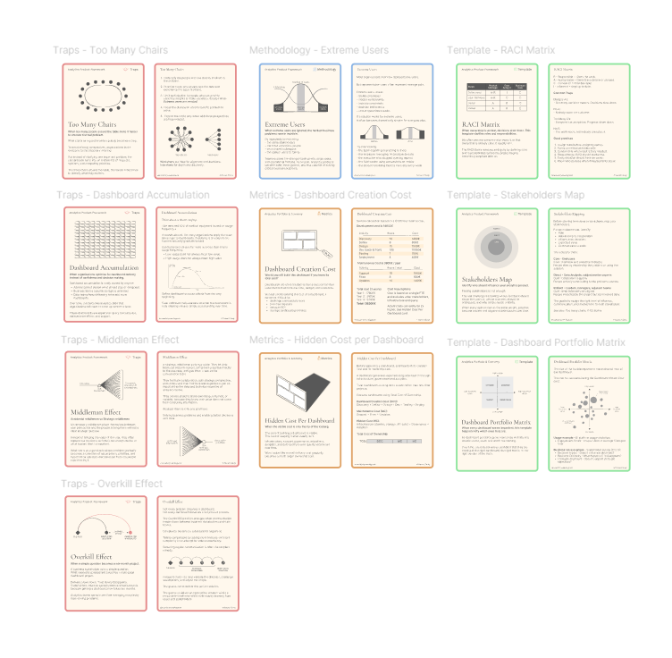
Already 10 cards! + Dataviz Design System
And that's it, I've now reached 10 cards.
Each card goes through many iterations, sketches, and hours of research before being published.
Every illustration is hand-drawn (yes, with a mouse, sometimes my graphics tablet), and I'm very proud of that process.
It certainly takes time, but I see it as an investment rather than a constraint.
Three cards already belong to a second deck called Analytics Portfolio & Economy, focused on helping organizations manage dashboard portfolios, costs, optimization efforts, audits, and diagnostics.
The first deck remains the Analytics Framework and focuses on turning business needs into useful, structured, and sustainable analytics products.
A tiny favor: move me out of spam
A few readers recently told me this newsletter was landing in their spam folder.
If that's the case for you, here are two quick ways to fix it:
- Drag this email into your Primary inbox.
- Reply with a quick "Hi" or any short message.
It only takes a few seconds and helps ensure future editions arrive where they belong.
Thank you so much!
New card : Hidden Cost per Dashboard
Last week, I introduced the Dashboard Creation Cost card.
This week, I'm introducing Hidden Cost per Dashboard.
I believe this is one of the most underestimated costs in analytics teams.
Without structure, visibility, and proper ways of working, hidden costs quietly accumulate and can eventually become far more expensive than the dashboard itself.
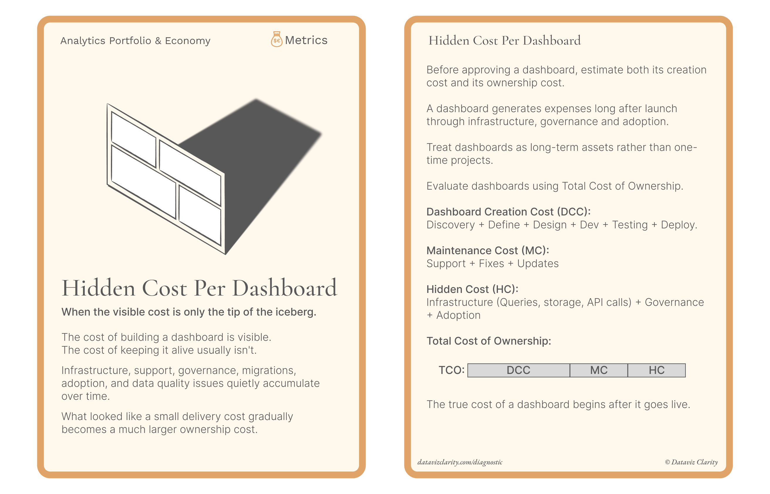
I'm building these card decks to help connect the dots between the different areas of the Analytics Operating Model.
A Dataviz Design System
Last week, I was also approached by a large French luxury company to help build a Data Visualization Design System.
I think it perfectly illustrates something I've been observing for years: organizations are no longer looking for a few dashboard templates or a collection of visual guidelines.
They're looking to transform the way dashboards are designed.
Together, we've started defining pillars covering Tableau and Power BI, but also multi-device experiences, change management, governance, user panels, and a more product-oriented approach to analytics.
The objective isn't simply to deliver assets.
The objective is to build a sustainable system.
Because when dashboards are placed side by side and none of them look, behave, or communicate information consistently, they eventually create a chaotic experience and, I believe, a degraded perception of data within the organization.
Interestingly, this company decided to activate budget specifically for this challenge.
I think many organizations postpone this type of initiative because it doesn't feel urgent.
Yet it slowly creates friction, inconsistency, and unnecessary complexity over time.
If this is also a challenge you're facing, feel free to reply to this email. I'd be happy to discuss it with you.
Have a great week everyone!
Aurélien
Looking for more analytics insights?
- Analytics Diagnostic: Identify your biggest analytics challenges and priorities.
- Youtube channel: Short videos about analytics, dashboards, and data teams.
- The Analytics Operating Review: Weekly insights for data and analytics professionals.

Responses