Logo de l'en-tĂȘte
Diagnostic Newsletter Blog Contact
Ateliers
Principes de conception pour l'analyse
Se connecter
← Back to all posts

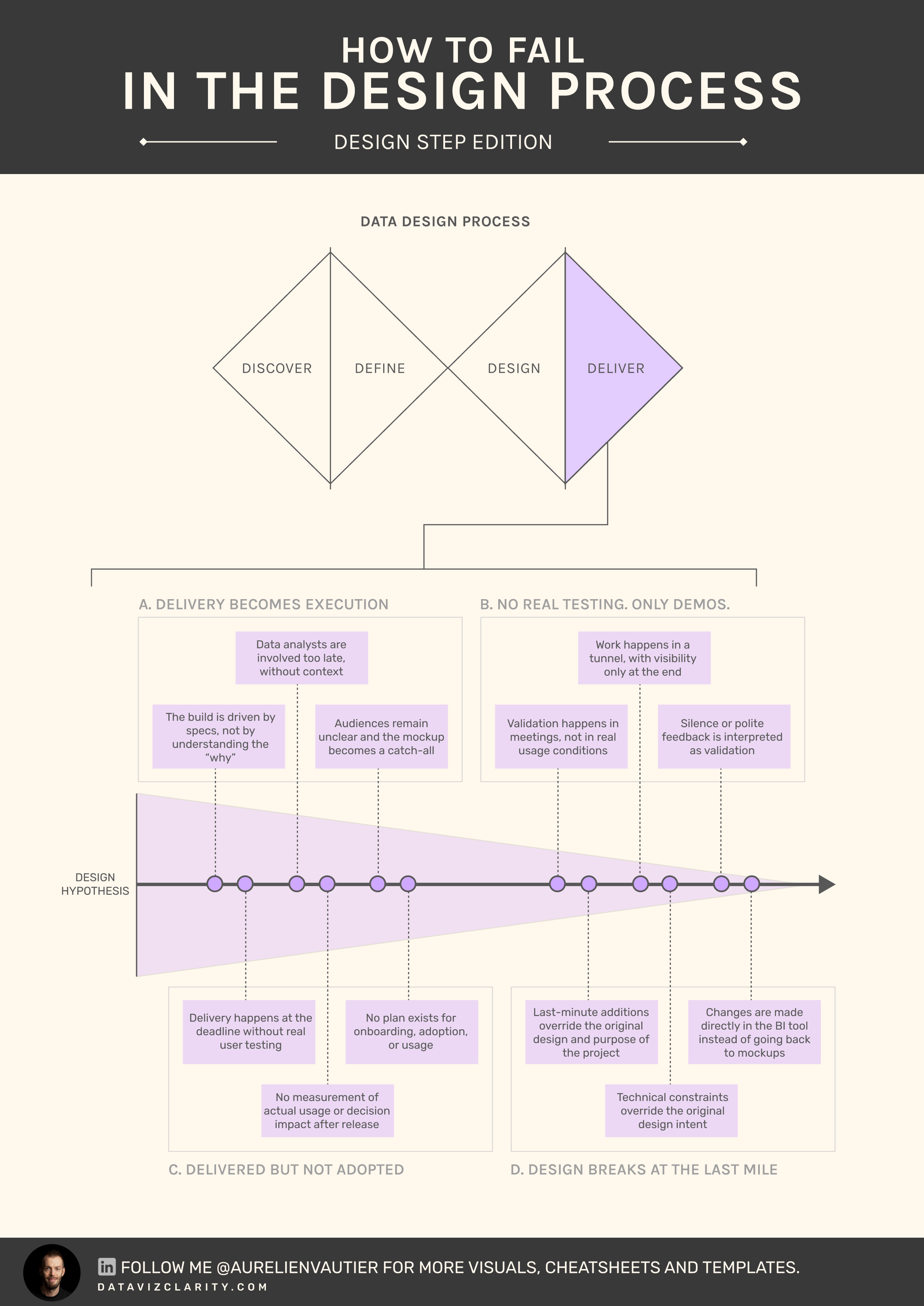
What could go wrong during 'Deliver'? - Part 4

Mar 24, 2026
Connect

The final delivery is often treated as the finish line.
In reality, it’s where most dashboards quietly die.

Dashboards are delivered on time.
Reviewed. Approved. Even praised.

Then adoption stalls.
Usage drops at week 2. 
Decisions don’t change.

The real problem is not the quality of the dashboard.
It’s the illusion of validation.

Delivery is treated as a presentation moment, not a confrontation with reality.

- No real testing.
- No real friction.
- No real ownership.

Time is wasted shipping products that will never be used
The Delivery Integrity Model

A simple way to assess how robust your delivery really is:

  1. Presentation
    The dashboard is shown. Feedback is polite. No real usage.

  2. Approval
    Stakeholders validate in meetings. No real-world testing.

  3. Exposure
    Users access the dashboard, but without guidance or context.

  4. Usage
    The dashboard is used in real workflows, with friction and feedback.

  5. Adoption
    The dashboard is embedded in decision-making rituals.

Most teams stop at level 2.
They think they’ve delivered. They’ve only presented.

Another quick corporate example

A data team delivers a new sales dashboard.

Final demo goes well.
Everyone agrees it "looks good".

Two weeks later, regional managers export data to Excel again.
The dashboard exists, but decisions haven’t moved and stays outside the BI tool.

Nothing failed technically.
Delivery just never reached reality.

A dashboard validated in a meeting is just a well-designed assumption.
Thumbs-up in Google Meet are not validation. It’s absence of friction

If dashboards are being delivered but not used, the issue is rarely visual. It’s structural.

I run diagnostics to assess where delivery breaks between design, validation, and adoption.

 Book a call with me here

Have a great week!


Responses

Join the conversation
t("newsletters.loading")
Loading...
The forgotten step between business needs and charts: Metric Design
*]:pointer-events-auto scroll-mt-(--header-height)" dir="auto" tabindex="-1"> *]:pointer-events-auto scroll-mt-[calc(var(--header-height)+min(200px,max(70px,20svh)))]" dir="auto" tabindex="-1"> I'm writing this week's newsletter from the Périgord region - France, where I'm taking a week off with my family. Being here made me think about something. Last year, 87% of my consulting revenue (...
Every analytics product should pass these three tests
*]:pointer-events-auto scroll-mt-(--header-height)" dir="auto" tabindex="-1"> *]:pointer-events-auto scroll-mt-[calc(var(--header-height)+min(200px,max(70px,20svh)))]" dir="auto" tabindex="-1"> During a recent workshop, several participants admitted they didn't know how to judge whether an analytics product was "good". Then I wrote three letters on the whiteboard: Useful. Usable. Used. Fr...
Introducing the Analytics Design Office
*]:pointer-events-auto scroll-mt-(--header-height)" dir="auto" tabindex="-1"> *]:pointer-events-auto scroll-mt-[calc(var(--header-height)+min(200px,max(70px,20svh)))]" dir="auto" tabindex="-1"> I'm excited to introduce a new concept I've wanted to build for a long time. The subscription model has transformed industries like design. I believe it's time to bring the same approach to analyt...

The Analytics Operating Review

What you’ll get every Tuesday A series of sharp visuals that decode common mistakes in analytics. Fast to read. Easy to apply. Hard to forget.
Logo en bas de page
Politique de confidentialité Conditions d'utilisation
© 2026 Dataviz Clarity