
We almost rebuilt the same dashboard. Again.
Last week, I was asked to support one of the largest insurance companies in France.
They already had a Tableau dashboard.
At first glance, it looked good.
Clean. Structured. Almost convincing.
But underneath, it was a mess.
The data preparation had been done in isolation by an apprentice.
No real visibility, no shared understanding.
He developed for 90 days and left.
The dashboard stayed.
And what was left behind was a heavy debt.
Hard to maintain. Hard to trust. Hard to evolve.
There were around ten pages. Too many filters.
Charts that looked impressive, but that no one could actually read.
Some of them had been pushed from a top manager.
Radar chart everywhere.
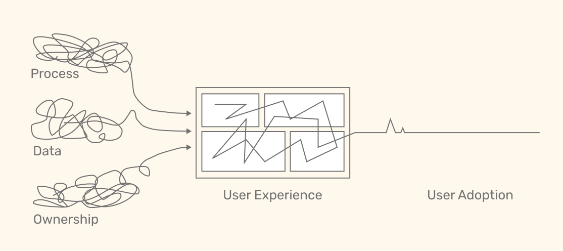
Undefined process. Messy data. No ownership.
Your dashboard never had a chance.
What you call a UX problem is a system problem.
They were there because someone wanted them.
Not because they helped.
We started with user interviews.
Not "what do you think of the dashboard?"
Just: what do you actually use and why?
Very quickly, things didn’t line up.
The dashboard was focused on call center performance.
But users needed to connect that to offers, digital products and sales...
Different teams. Different data. Different expectations.
The problem wasn’t the dashboard.
It was the scope from the start.
At that point, I saw the shift.
The project manager started to feel overwhelmed.
And the reflex kicked in:
"Let’s talk to more people"
Which usually means one thing= You’re about to lose control of the scope.
So we paused.
Instead of adding more, we reduced.
Three screens (Constraints force clarity.)
Not ten.
A clear flow, based on actual users.
And before rebuilding anything, I proposed three things.
- RACI.
To clarify who does what. Before and after production.
- Stakeholder mapping.
To see who’s involved, and at what level and importance.
- Content mapping.
Everything already existing around the topic.
Tableau, Business Objects, Excel, CSV, Google Sheets.
So, the goal was simple:
Understand before rebuilding.
And avoid rebuilding it a third time this year.
We were (highly) suggested to present this to the project manager’s manager...
A few hours later, I got the feedback.
The approach was appreciated.
But also described as "too direct" and "too data-driven".
I didn’t expect that.
Because what I proposed was just… concrete.
But then it made sense.
This kind of approach forces clarity.
And clarity means:
- defining roles
- assigning responsibility
- making decisions visible
And in some organizations, that’s exactly what people try to avoid.
Not always consciously.
But the system adapts around it.
We’ll try to move forward with the RACI and the content mapping.
But honestly, I’m not sure yet how far it will go.
I’ll keep you updated.
Before going further, I need your input.
I’ve put together a very short poll (2 questions).
It will help me understand where things actually break in your company.
If something feels off in your analytics team, trust it. Something is broken.
Let’s identify where and fix it.
🇫🇷 En français :
In English :
Have a great week everyone!
Aurélien

Responses