
Le syndrome du tableau de bord "Mailbox"
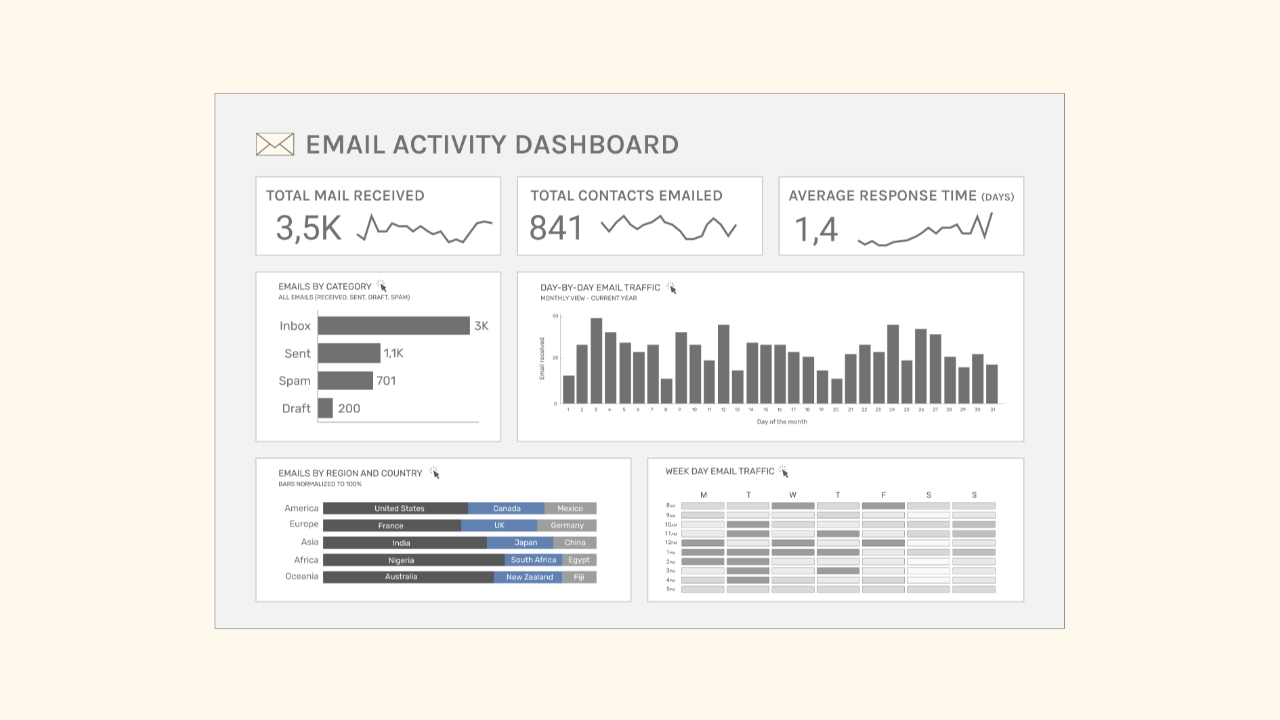
Parlons maintenant du tableau de bord Mailbox ci-dessous.
J'ai créé ce tableau de bord à partir de données Gmail fictives. Il comprend des indicateurs tels que :
- nombre total d'e-mails reçus
- nombre total de contacts ayant reçu un e-mail
- temps de réponse moyen
- classification des e-mails par catégorie
- date (jour du mois et de la semaine)
- région et pays d'implantation
Il y a toutefois quelque chose qui cloche avec ce tableau de bord. Son aspect est correct, loin d'être parfait, mais ça passe.
Je serais curieux de savoir, après y avoir réfléchi un instant, ce que vous amélioreriez dans ce tableau de bord.
Y a-t-il quelque chose qui te frappe ? Quelque chose qui te semble bizarre ?
Participez au jeu : repérez au moins deux points à améliorer.
** Musique d'ascenseur **
Maintenant que vous avez examiné ce tableau de bord, vous faites sans doute partie de la majorité qui se concentre sur l'esthétique ou les fonctionnalités lorsqu'elle donne son avis.
Mais le véritable problème avec ce tableau de bord, c'est que :
Mais qui va vraiment s'intéresser à ce tableau de bord ?
La réponse : personne.
Un service de messagerie électronique doit nous permettre d'accéder rapidement à nos e-mails, d'y répondre facilement et de les consulter à tout moment de la journée.
Personnellement, je n'aimerais pas voir s'afficher une page récapitulative des chiffres avant d'accéder à mes e-mails.
Ce n'est pas le but d'une boîte de réception.
C'est la même chose avec les données de votre équipe. Certains projets ou certaines tâches ne nécessitent pas forcément un tableau de bord simplement parce que nous disposons de données.
Ce tableau de bord est un piège dans lequel nous tombons tous tôt ou tard : on crée un tableau de bord à priori utile, mais qui, au final, ne sert à rien.
Le syndrome du tableau de bord « Mailbox » est un problème courant.
Je m'efforce toujours d'adopter un regard critique afin de m'assurer que nous ne mettons en place des solutions que lorsqu'elles sont nécessaires, utiles et qu'elles apportent une valeur ajoutée à l'entreprise.
The Analytics Operating Review
A series of sharp visuals that decode common mistakes in Analytics.
We hate SPAM. We will never sell your information, for any reason.